A brand for a new canyon, from the logo to the maps.
- Client
- Squamish Canyon
- Sector
- Tourism
- Disciplines
- Digital Product, Story and Experience
Introduction
Squamish Canyon sits in BC’s coastal rainforest, in the UNESCO Howe Sound Biosphere. We built the new eco-tourism destination’s brand from the ground up.
Brand
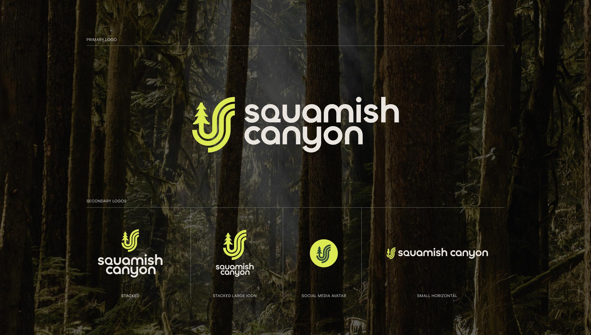
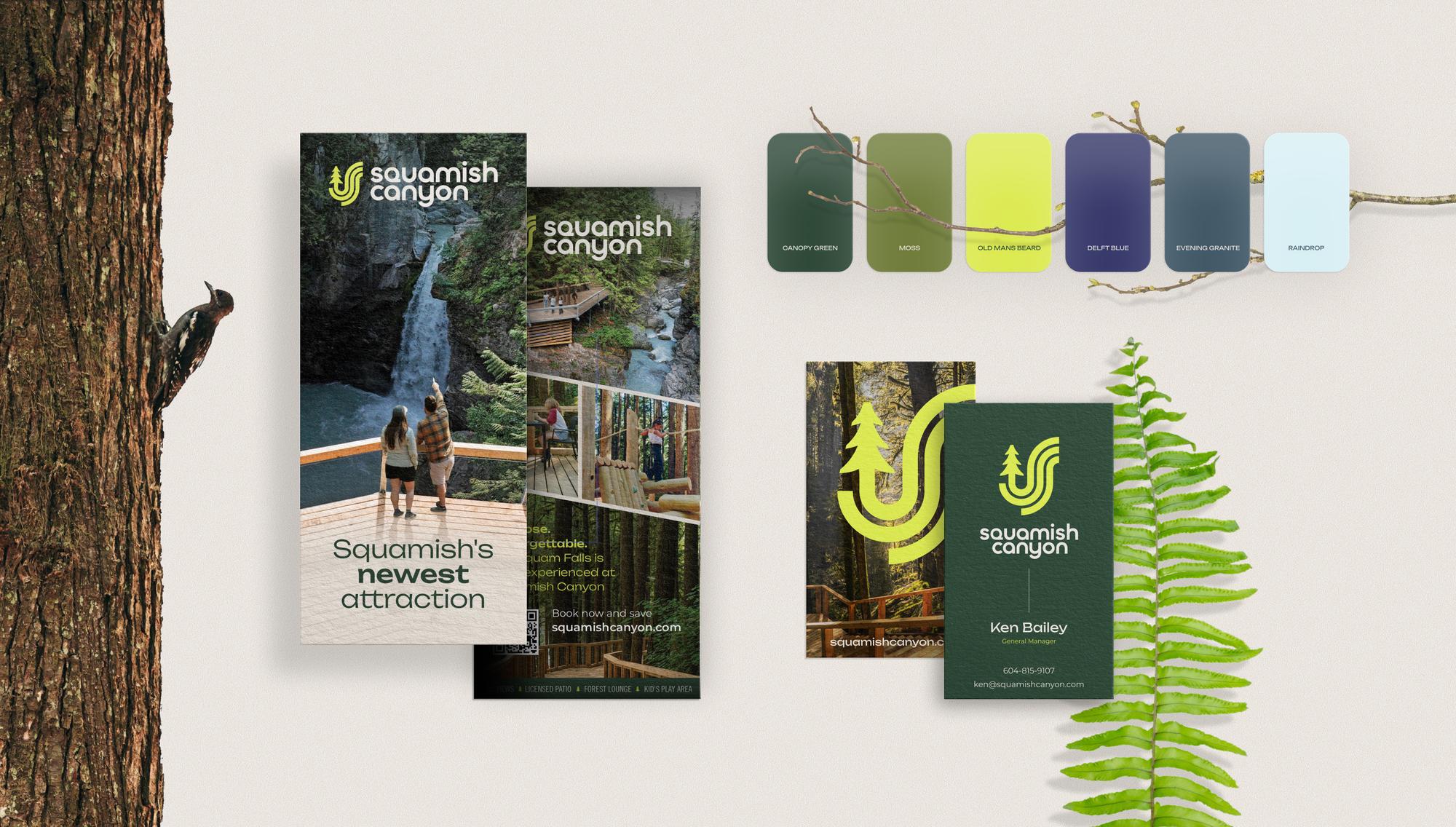
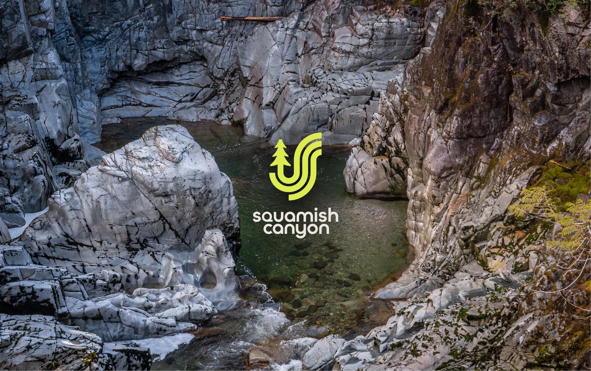
A visual system drawn from the landscape: forest tones, natural textures, and the geometry of the canyon itself.
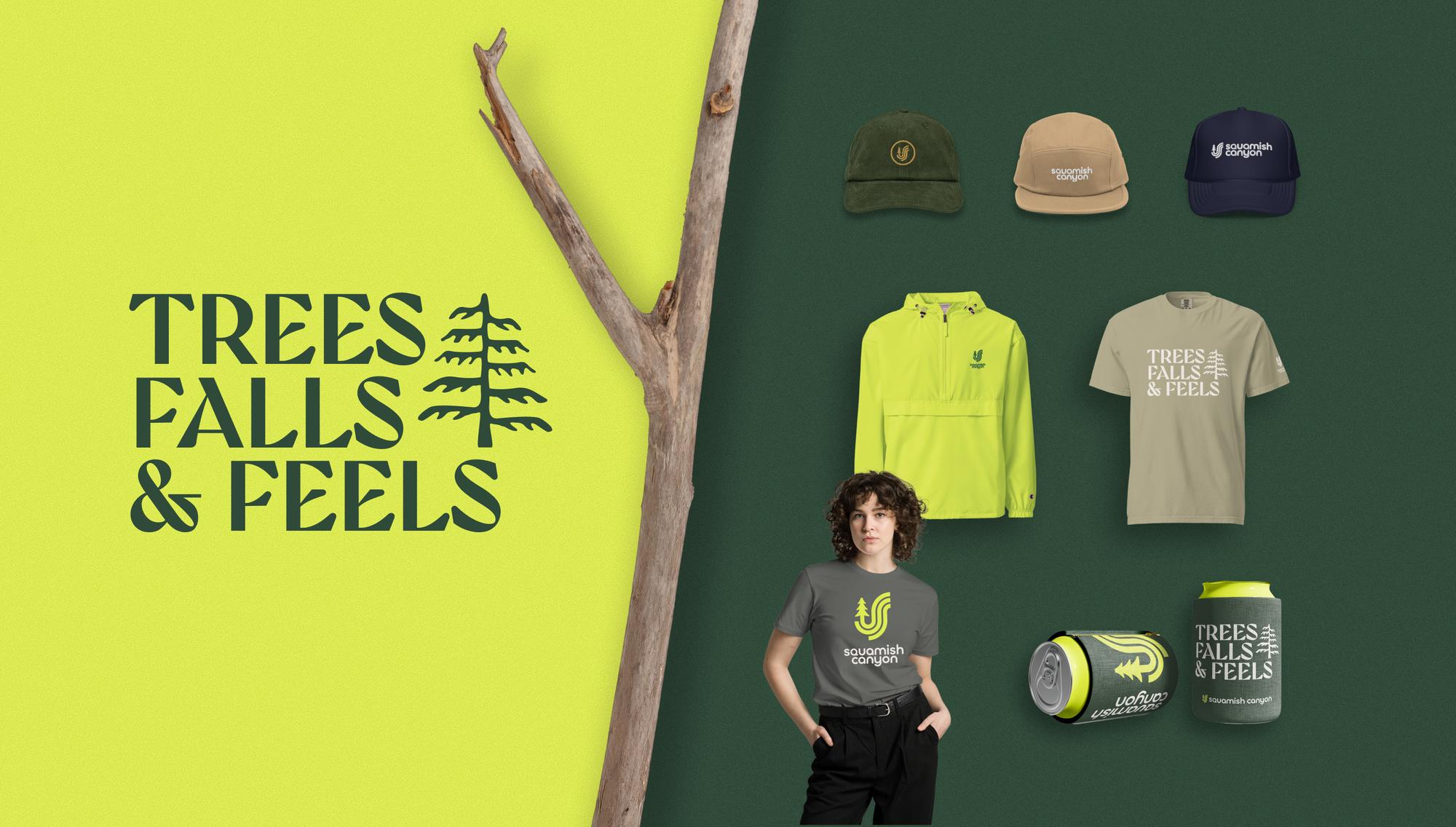
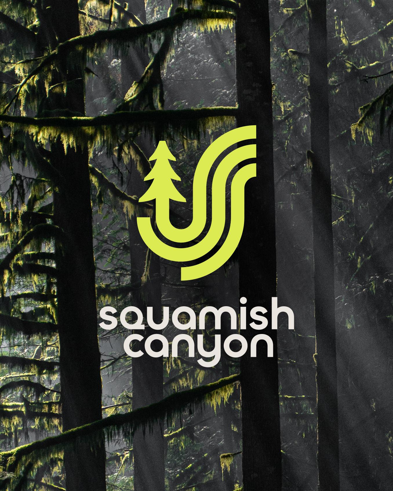
With no existing identity to build on, we created everything from the logo and design system to print collateral, maps and merchandise.
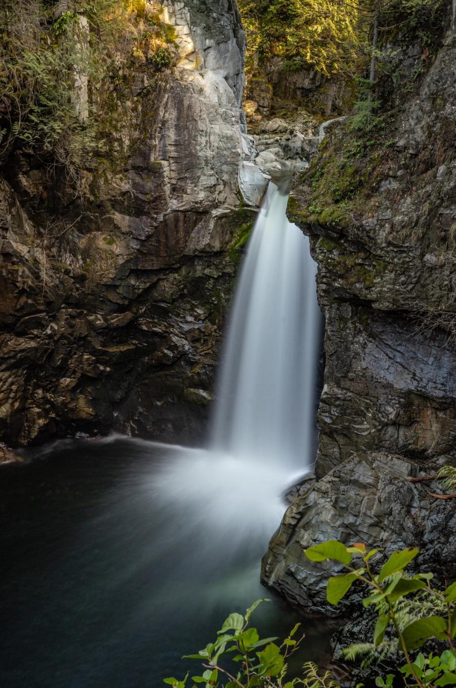
Trees, Falls & Feels sums up a visit: elevated walkways through the forest, past waterfalls.
Website
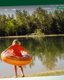
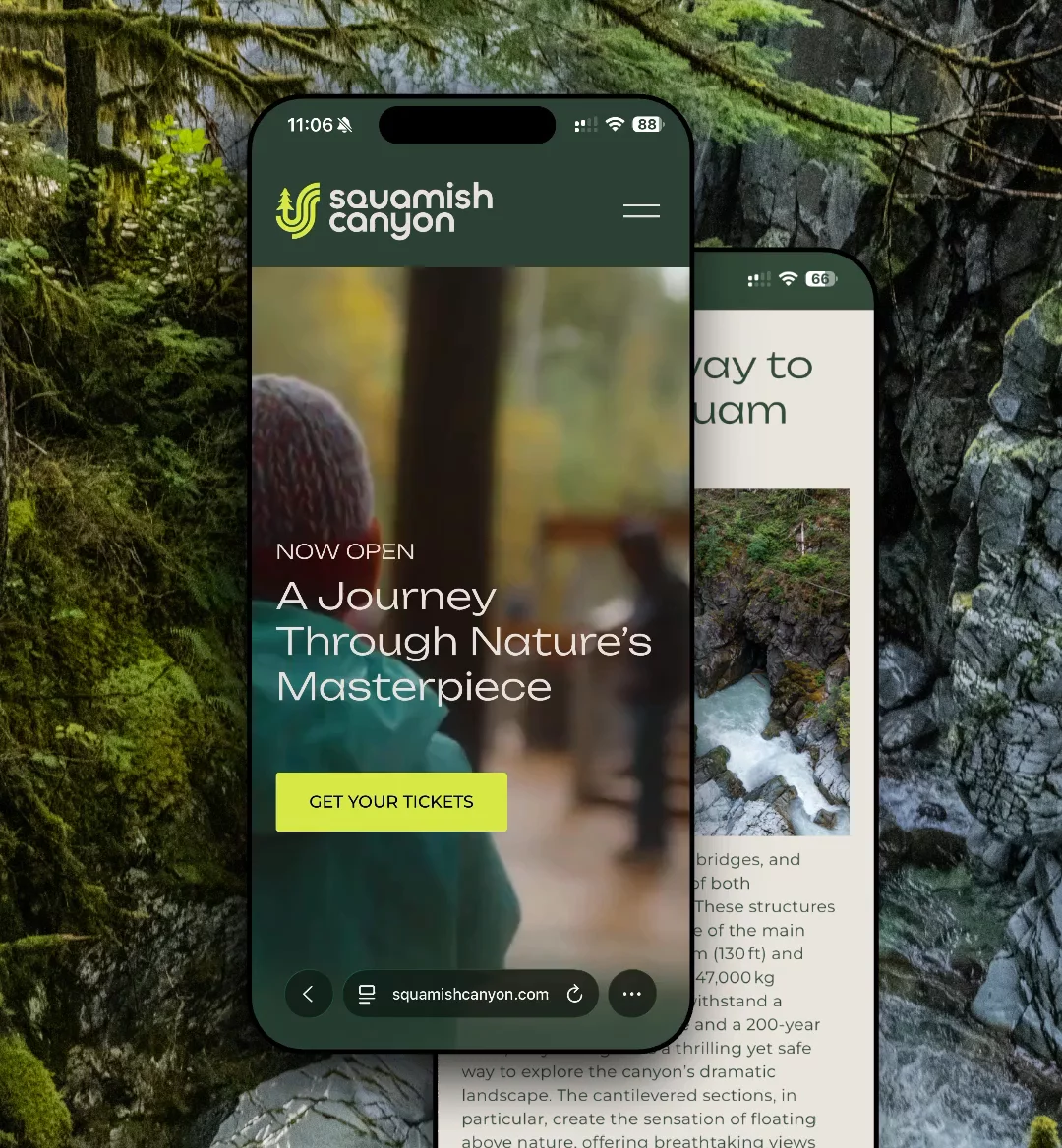
A website for planning the visit, and for the visit itself.
We designed and launched a website that brings together the canyon’s story, trip planning and ticketing.
A social and paid media strategy supported the launch, along with custom print collateral and maps.
- 01
Storytelling
The canyon’s story, told before the visit.
- 02
Trip planning
Planning a visit and buying tickets in one place.
- 03
QR wayfinding
Codes on the interpretive panels link to more on the website.
- 04
Paid social
A launch campaign across social and paid media.

Photography
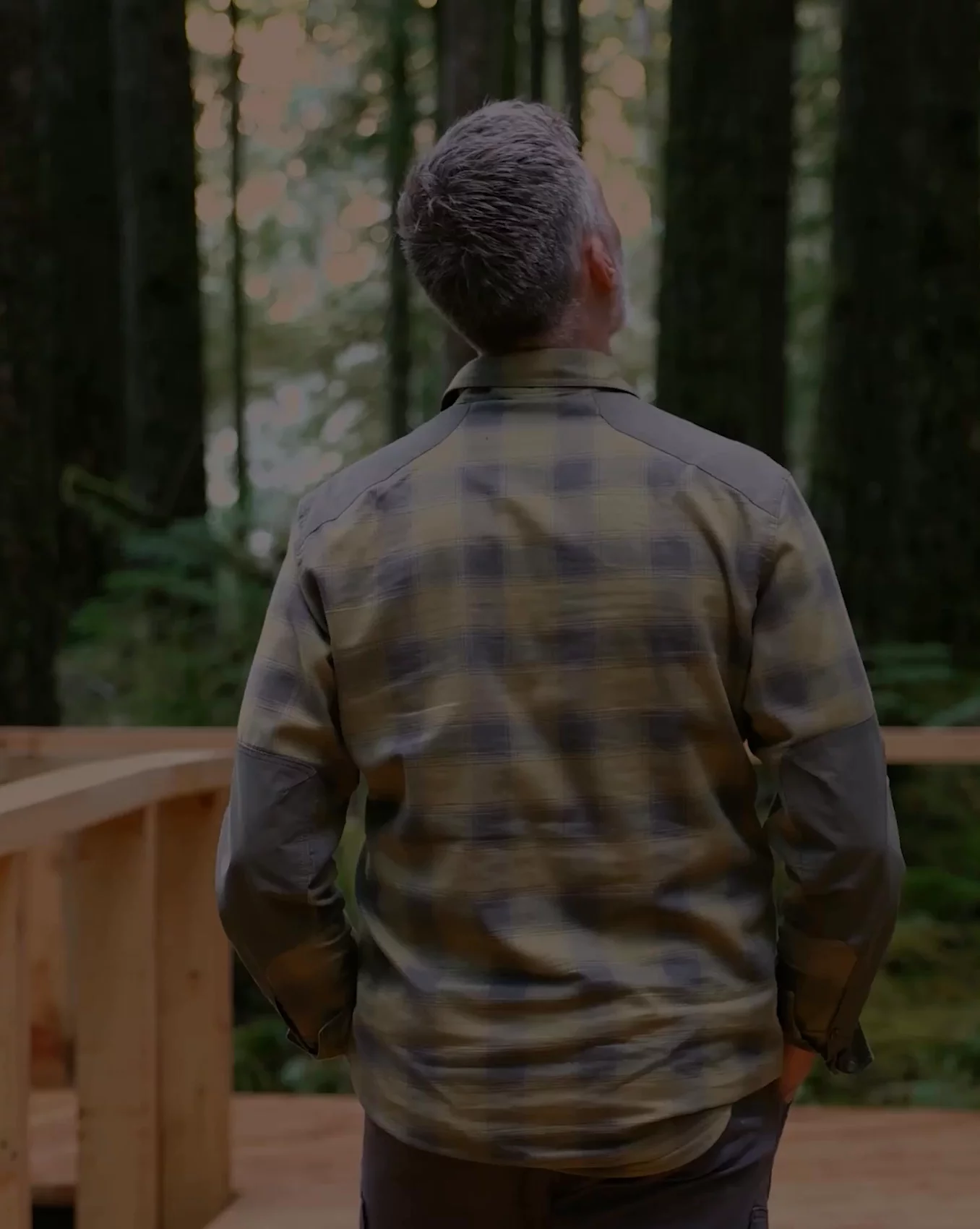
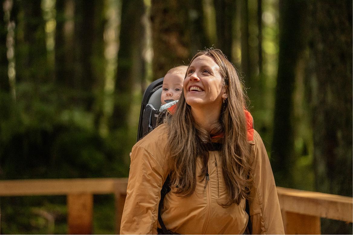
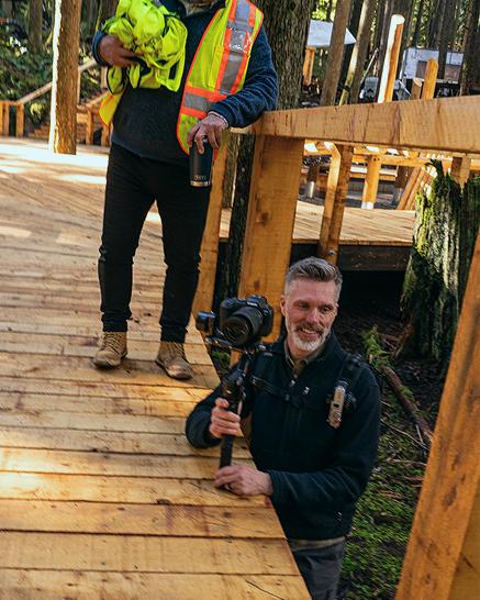
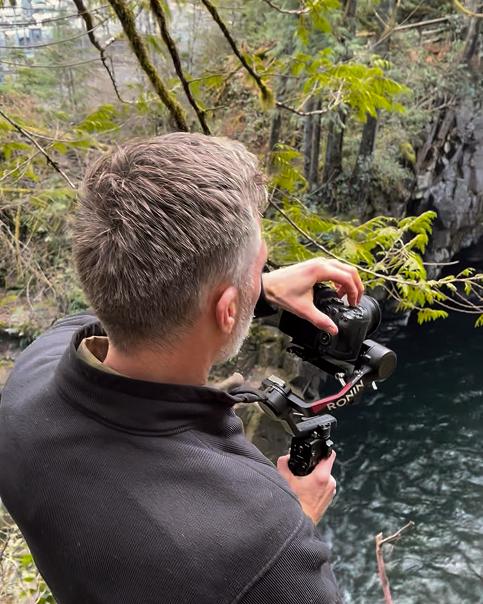
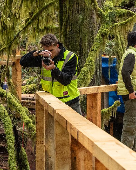
We photographed the canyon late in construction, before it opened.
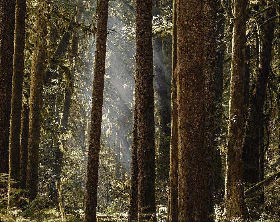
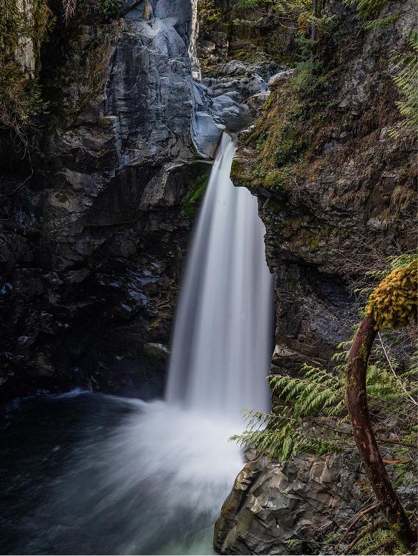
The photographs and video we made started the canyon’s photo library.
As part of the brand, we set the direction for ongoing photography, so new images keep telling the same story.


Services
Digital Product
- UX and conversion
- UX and UI design
- Design system
Story and Experience
- Logo and brand identity
- Graphic design for print and web
- Photography and video
- Photography and video direction
- Market research and analysis
- Audience segmentation
- Channel planning
- Campaign concepts
- Paid social strategy and buying
- Ad design and production
- Ad copy
- Campaign management
- Conversion rate optimization