What art direction is
Art direction decides how something should look and feel, then holds every piece of the work to it: colour, type, layout and imagery, but also the rhythm of a page, how motion eases in, the tone of a button label, the texture of a photograph.
Brand expression is how an organization’s identity shows up in all of that: the impression people build from every encounter.
Why we do it inside the work
Brand decisions are best made against something real. A colour palette tested on a logo tells you little. On a booking flow, a trail map, a video and a social post, it shows whether it holds up.
So brand work is part of the build:
- A new destination: the identity develops alongside the website and the on-site wayfinding, which have to work together.
- A refresh: done as part of the platform that will carry it.
- A campaign look: built with the templates and rollout plan that will use it.
What goes into it
A complete art direction usually includes:
- A visual system. Colour, typography, grid and the rules for combining them. For digital work it connects to a design system, so it can be built and maintained.
- Imagery direction. Photography, illustration, 3D and video: subject matter, framing, colour treatment and what to avoid.
- Motion principles. How things enter, exit and respond. Motion carries personality as much as colour does.
- Voice and tone. Headlines, microcopy, error messages and calls to action, matched to the visual register.
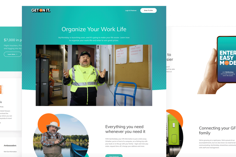
- Application examples. The system working across the formats it will meet, from phone screens to large displays to printed panels.
Building from the subject
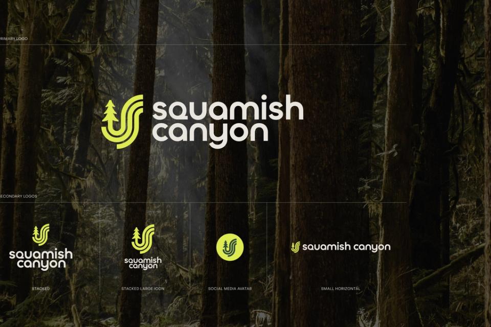
Strong visual systems often come from the subject itself. A landscape can supply a palette, a texture and a geometry; an organization’s history, a typographic voice; a product’s mechanics, a motion language.
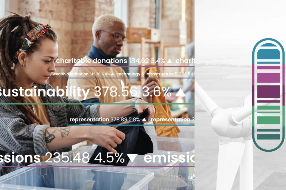
For a destination, we spend time with the place: its colours in different light, its materials, its shapes. For an abstract subject, like a data platform or a research institute, we look for what’s distinctive in how the organization thinks. The aim is a system that couldn’t belong to anyone else.
Design-literate audiences notice the craft details: typographic spacing, image quality, consistent corner radii, how a hover state feels. They signal care, and they’re where generated output most often slips.
Consistency at scale
Volume makes brand expression harder. Campaigns need many formats, sizes and audience variations, more of them made with generative tools, and without clear direction quality drifts.
So we write art direction down precisely enough for others to follow (rules, examples, clear “not this” guidance) and build it into the templates, design systems and generative production pipelines that produce the work. Consistency stops depending on someone checking every asset by hand, though designers still review what goes out.
The same documentation is the context AI models work from, so generated layouts and copy start from the brand’s rules instead of generic defaults.
Directions tested on real content
- Start from the concept and the audience, which art direction serves.
- Explore a few distinct directions on real content, and choose one together.
- Refine through the actual work, as the direction meets real layouts, photography and motion.
We’ll say what we think works and why, and change our minds for good reasons, especially when something that looked right in isolation doesn’t hold up in use.
What we don’t do
We don’t take on standalone logo, naming or brand strategy work that isn’t connected to building something. If brand is the whole project, a dedicated brand agency will serve you better. When a brand goes into market, we design and build what carries it, from campaign assets to the site, and keep supporting and developing that work after launch.